GUIDE
The BOIXAC visual system: logotype, colours, typography and application examples. A clear, precise and operational document for all authorised collaborators working with our brand.
We can."
BOIXAC designs bespoke heat exchangers — solutions for the most complex processes. Every unit is born from a technical conversation, not a catalogue. Every client deserves a design that truly understands their process.
From Barcelona to the heart of industrial plants across Europe, Asia, Africa and the Americas.
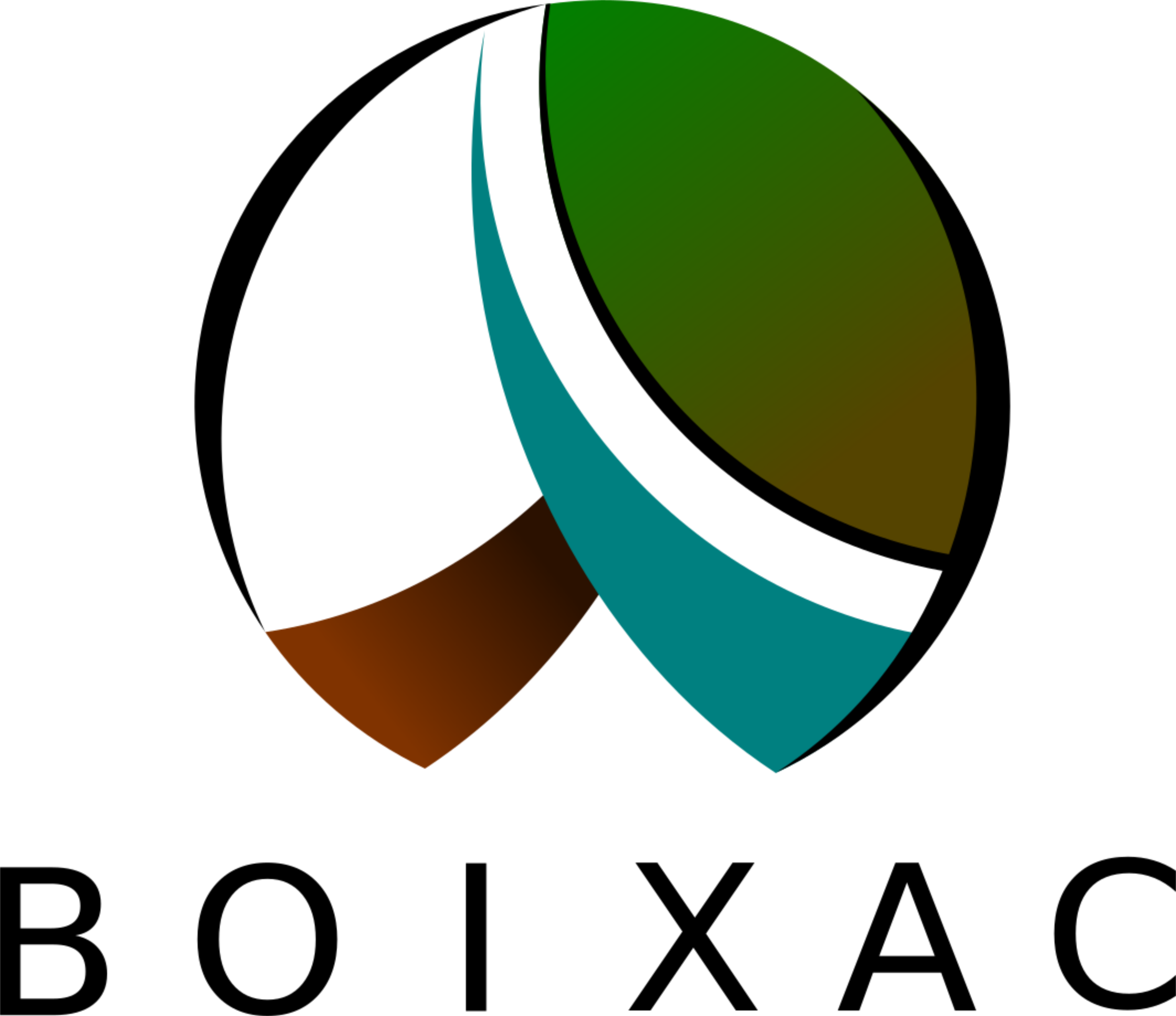
The Logotype
Pure geometry: 9 overlapping circles identified and measured pixel by pixel from the original file. No Bézier curves. No arbitrary arcs. A symbol that scales from 12px to 10 metres without loss.
The six official variants
On white and light greys
Covers, dark backgrounds
100% white on teal
On #034640
Internal documents
Favicon, embroidery <20mm
The meaning of the symbol
Teal
Technology, fluid and precision. The colour of applied thermal transfer.
Green leaf
Commitment to energy efficiency and sustainable industry.
Earth
Industrial roots. Real processes, real materials, the weight of manufacturing.
Circular form
Continuous improvement and optimisation. The same approach we apply to every project.
Colours
Technology · Fluid · Precision
Nature · Efficiency · Sustainability
Heat · Activation · Industry
The teal gradient — The visual signature
Proportions 50·30·20
Typography
Correct and incorrect usage
BOIXAC
Heat Exchange Solutions
Mollet del Vallès, Barcelona · boixac.com
All brand usage enquiries: [email protected]